This activity asks students to use two internet tools to look at global circulation features such as midlatitude cyclones, the ITCZ, and subtropical highs. In my class they created a PowerPoint file full of their images and annotations and submitted it. The internet tools are free and are the same ones that I have used in Lectures 9 + 10. If you don’t have PowerPoint you could use Google Docs or something similar:
This activity gets into identifying fronts and reading weather maps. In this lecture I didn’t really go into how to read weather maps or weather symbols, but if you are interested in this you can probably figure it out pretty easily. This activity comes in two parts – the maps and the questions. I’ll have to make a video that explains more on how to do this, but for the first part you are trying to figure out where any fronts might be. To do this, look at the temperatures of the weather station symbols on the map. Look for where there is a fairly sudden drop in temperatures, for example, to identify where a cold front might be.
Part of this lecture is about soundings and the structure of the atmosphere. I have an activity (further down below) where students plot data from a weather balloon to “discover” the troposphere and stratosphere. I have several data sets to choose from – all from the same weather balloon but at different resolutions (different amounts of data to plot). When I do this activity with my students, we have not talked about the structure of the atmosphere at all yet. After they plot it, then we annotate it and talk about the atmospheric layers. If you watch the lecture, this data is the same set that I am using on screen. So in a way the lecture kind of gives away the answer.
I also have some activities that are centered around interpretation of different soundings. In this lecture I do not emphasize the soundings too much, but in previous classes I did. So you may or may not be able to answer all of the questions. This activity forces you to really understand dew point and relative humidity to make sense of what is going on:sounding_examples_II
This is the diagram that I am using in the lecture to work out where the clouds form: convection worksheet handout
This assignment asks students to trace out any clouds that might exist in the atmosphere using the same technique as outlined in the lecture: convection_worksheet
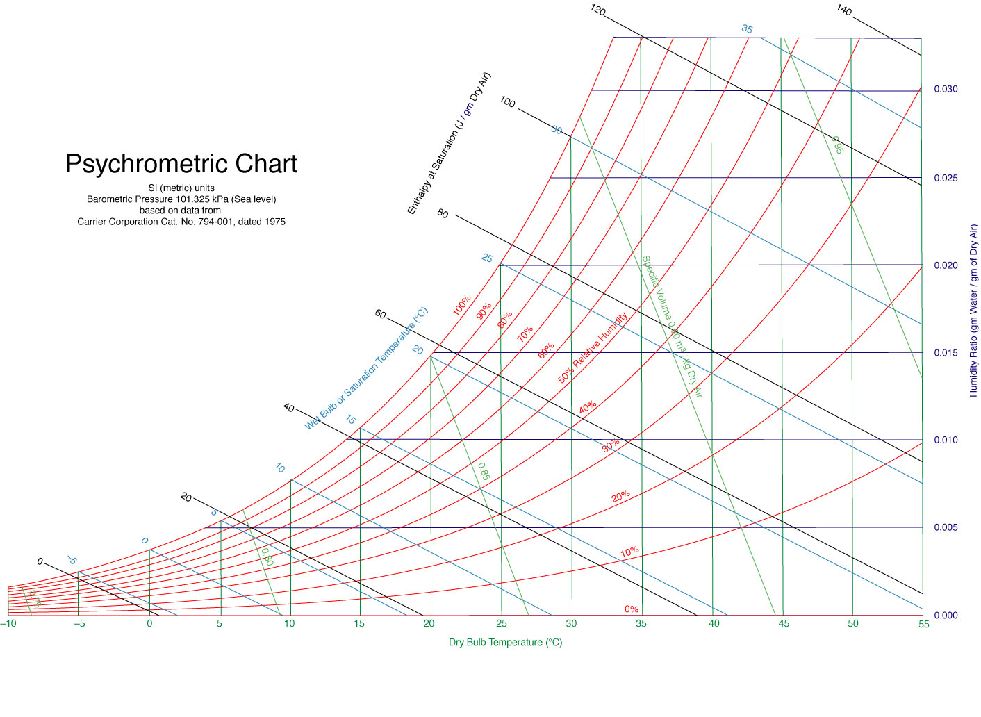
The following starts with a hands-on experiment for determining relative humidity, then has some questions related to relative humidity and evaporation that don’t require the experiment to answer. In order to do the experimental part, you need a glass thermometer, some cotton balls, some string, and the graph below. If you have rubbing alcohol and acetone (fingernail polish remover) you can do even more. But if all you have is water, you can determine relative humidity. Do determine relative humidity, first take the temperature of the air. This is called the “Dry Bulb” temperature. Then wrap cotton completely around the tip (the red end) of the thermometer and tie it on. Wet the cotton, squeeze out the excess. Then wave the thermometer back and forth in the air. As you do so, the water will start evaporating from the cotton and will cool the thermometer. Check the temperature and you should notice that it is cooling. Keep waving it back and forth until the temperature bottoms out and it does not become any cooler. This is the “Wet Bulb” temperature. With these two values and the chart below, you can approximate the relative humidity.
I then have my students repeat the wet-bulb temperature experiment with rubbing alcohol and acetone. What they will find is that both of those will cool the thermometer even further. Most of the girls in the class are familiar with the “cold” feeling of acetone (fingernail polish remover). This experiment explains why this is – the acetone evaporates rapidly, removing latent heat. The alcohol and acetone are not used to determine relative humidity – only the evaporation of water is used for that.evaporation and latent heat
The answer key does not contain any information for the first part, because it depends on the conditions of the experiment. But it does have answers to the second part, which are questions about relative humidity and evaporation:evaporation and latent heat_KEY
This chart is needed to calculate Relative Humidity from the two measurements. It is not as confusing as it first appears. Start with your dry-bulb measurement. Find the vertical green line that represents your dry bulb temperature (most likely your measurement will be in-between two of them). Now find the light blue lines that are moving at an angle – these are the web-bulb measurements. Yours will likely be in-between two of them. The spot on the graph where your vertical dry-bulb line intersects with your angled wet-bulb line will land somewhere between the curved red lines. The red lines are values of relative humidity. Estimate where you are between them and that’s your answer.
This is the second set of humidity problems (first set was with Lecture 2). These include questions regarding Mixing Ratio, Dew Point, and now Relative Humidity. Some require some simple math (multiplication or division), some are “thought questions.” You may need the Mixing Ratio Chart from Lecture 2. Humidity Problems II - Relative Humidity
This table/chart relates Mixing Ratio, Dew Point, and Temperature. I calculated the values for Albuquerque’s altitude, but if you live somewhere else it is close enough:mixing ratios
These are some problems about Mixing Ratio and Dew Point. If any math is required, it is only multiplication. You might need the chart above. Other problems are more “thought problems” to see if you get what is going on or not:practice problems with humidity I
There is also a simple hands-on experiment that you can do to measure the dew point. Take an empty aluminum soda can and cut the top off. If small kids are involved you might want to tape the cut edge because it can be sharp. Fill the can halfway with room-temperature water. Get a glass thermometer and some ice cubes. It works best with crushed ice or tiny ice cubes. Put one single small piece of ice in the can. Stir it until it completely melts. When it is gone, put in another, and stir until it completely melts. As you are doing this, the temperature of the water inside the can is cooling. If you continue this process, you will eventually cool the surface of the can until it at the dew point*. When this happens, you will notice condensate starting to form. You want to catch the temperature at which it first forms – it will be a foggy film at first – not big drops. Take the temperature of the water at this instant when the condensation first forms, and that temperature is the dew point temperature of the air.
* This ONLY WORKS if the dew point is greater than 0C or 32F! Otherwise you cannot get the water cold enough to make dew. If you live in the US you can check the local weather conditions from weather.gov which will give you the current dew point. For most people, this will not work during the winter because the air is too dry. But it really depends on where you live.
Although most of these cloud pictures are ones that I personally photographed, there are some that I found somewhere on the internet long ago. If you see a photo that is copyrighted, let me know and I will either add the source citation or remove it.
These are relief maps for the state of New Mexico. If you attended one of my workshops, you probably received a laminated version of one of these. Each file is the same thing – just at different resolutions.
LARGE: large-New-Mexico-relief-map-COLOR [Warning – this JPG has a resolution of 12445 by 13800 pixels and a file size of 77MB. Even high-end computers will struggle to edit and print this.]
I showed excerpts from this video in my workshops. This one video has two different things in it.
Spatter cones and fissure eruption up to the first 1:30 of the movie.
After about 1:30, the rest of the movie is of an AA flow. I showed this portion in the workshop. Although there is wind noise, you can hear the sound of the glassy boulders as roll down the front of the advancing lava front.
YouTube blocked at your school? Download the video here: aa_iceland [aa flow portion only, MP4, 100MB file]
Overview: This project is a cross-cutting activity that asks students to first create scatter plots / line plots of data from a weather balloon and then interpret the physical meaning of their graph. They discover how temperature changes with altitude and how the lower atmosphere is structured. The students then fill in their graph with features of the atmosphere. More advanced students can continue on to Part II of this project.
Video above will walk you through this project.
Weather balloon data: Your students will need one of the files below. Each has the same data from the weather balloon, but they differ in that I have highlighted (shaded) different alternate rows for the students to plot. I only have my students plot the highlighted rows, not the entire set. It would be ridiculous to have them plot all of the data by hand and the overall pattern of their graph will more ore less be the same no matter which subset of points you have them plot. You can decide how many data points you want your students to plot….I have indicated how many total points that will need to be graphed for each file. If you don’t know which one to use, start with the easy one first (11 points).
Answer keys: An excel-generated plot for each of the above datasets. Please realize that the aspect of your students’ graphs will depend on the scale you use. Pick the answer key that matches the dataset you are using.
July-4th-soundings-all-points-graph [PDF] for all data that the weather balloon generated. After the students have made their plots, I show them this graph to illustrate what their graph would have looked like if they had plotted ALL of the data. The general shape is the same is theirs, but there is more detail – more variations in temperature.
If you took one of my workshops on Space Engine, you can download space engine here and you will get the exact same setup that we used in the workshop. First download then file and then follow these steps:
The file you downloaded is compressed. Open it and inside is a folder called SpaceEngine. Drag this folder to your desktop to decompress the folder.
Within the SpaceEngine folder you just created on your desktop is another folder called ‘system.’ Within the system folder is the actual program (SpaceEngine). Open it.
The very first time you run SpaceEngine, it will take a while as the program generates a bunch of graphics files. It will not take nearly so long after the first time.
When you finally get to the main menu and select ‘planetarium’ you will positioned near the Earth. Each time you exit the program and restart you will end up back in this same spot. This is how I had it set up in our workshop.
If you want to install on another computer, go back to the original file that you downloaded and follow the same steps above. This program does not go through the normal Windows installation process. This is a good thing, because if someone from IT has locked down your computer, you can still run this program. However, if you copy the folder to another computer after you ran it once, the likelihood of success goes down. It is best to start with the original file and let the computer a bunch of necessary files during that initial first run.
For the original installation files, please visit the official Space Engine site. This amazing program is free, written by one guy in Russia, who survives on donations.


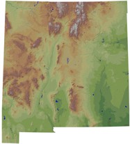 These are relief maps for the state of New Mexico. If you attended one of my workshops, you probably received a laminated version of one of these. Each file is the same thing – just at different resolutions.